Feedback Wanted: Devoid Frame (Custom Edition)
This is just an experiment and doesn't guarantee we'll be adding these, so take it with a grain of salt.
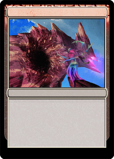
With that being said, how would the community feel about us adding some special devoid frames to the M15 editor. The reason they are "custom" is because we aren't set up to do the transparency in the border. Instead we are opting to add a darkened version of the normal color background for the card. This has a similar effect of the devoid frames and allows us to add the new top borders to the existing editor without too much work.
Here is a quick preview mockup (there is a white border space we would remove in the final version.)

Do you like this idea? Anything you would change? Is it not worth the effort if we cannot get the transparency?
Let us know, thanks!
With that being said, how would the community feel about us adding some special devoid frames to the M15 editor. The reason they are "custom" is because we aren't set up to do the transparency in the border. Instead we are opting to add a darkened version of the normal color background for the card. This has a similar effect of the devoid frames and allows us to add the new top borders to the existing editor without too much work.
Here is a quick preview mockup (there is a white border space we would remove in the final version.)

Do you like this idea? Anything you would change? Is it not worth the effort if we cannot get the transparency?
Let us know, thanks!
This discussion has been closed.
 MTG Cardsmith Community Forums
Comments
Personally it feels a little hollow to have
quasi-devoid.
If it's truly no trouble then I say go for it. It's nice to have variety, but the main issue I find is the reason people would want the transparency is to make the card feel more genuine. As it stands with this, it feels like it's on the right track, but not quite there for an authentic feel. The devoid border is really narrow a scope to consider worthwhile if it would sap limited resources or time.
That's just my opinion on it.
Thanks for the consideration and for giving us a sneak peek at something you've been working on!