Trying to bring alternate templates to MTGCardsmith: First test
Hello everyone =D
You know every set has a mechanic that requires an alternate card template which will make this set feels extra-special (Miracles, enchantment-creatures, face-down cards, devoid cards, double-faced cards, vehicles,...)


I'm currently trying to find a way for bringing an alternate card template on MTGCardsmith. As you obviously can't change the card template itself, I'm trying to bring an extra layer on the art itself to see if I can make it feel like a special card template.
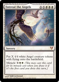
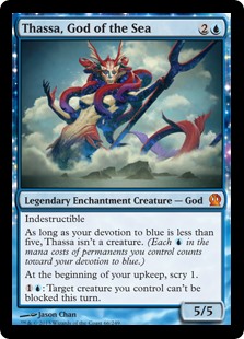
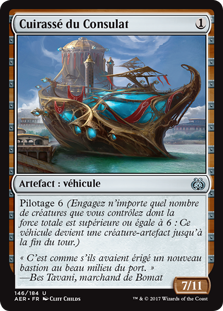
Here's what it looks like so far:
I need your opinion on this: What do you think of the visual concept? Does it feel like a special type of card? What do you think of the colours? Does it feel too Hearthstone-y? What would you change?
Any input would help! I'm at a very early stage of this concept so everything is possible ^^
Thanks for reading this! Have a good day =D
You know every set has a mechanic that requires an alternate card template which will make this set feels extra-special (Miracles, enchantment-creatures, face-down cards, devoid cards, double-faced cards, vehicles,...)
I'm currently trying to find a way for bringing an alternate card template on MTGCardsmith. As you obviously can't change the card template itself, I'm trying to bring an extra layer on the art itself to see if I can make it feel like a special card template.
Here's what it looks like so far:
I need your opinion on this: What do you think of the visual concept? Does it feel like a special type of card? What do you think of the colours? Does it feel too Hearthstone-y? What would you change?
Any input would help! I'm at a very early stage of this concept so everything is possible ^^
Thanks for reading this! Have a good day =D
This discussion has been closed.
 MTG Cardsmith Community Forums

Comments
Here's two more examples to get a more consistent feel of the template (and mechanic):
How'd you make this template in the first place? Photoshop?
Thanks for feedback! =D
While I think you've done an amazing job, definitely to Hearthstone-y for me. Also, I don't really like the "loss of art" required to fit that template in there.
In short, this is not something I like. But great job anyway!
I'm trying new things but I think I'm going to think about it a little more to get to something more concluant ^^
On the first one, I keep the Hearstone feel but I removed the first outer layer of frame while opening inside the arabesques so you kinda see the art through the frame.
On the second one (two versions: blue or gold), I completely remove the inner frame as well which, I think, considerably reduce the Hearthstone feel (but I could work something out to make it look less cartoon-y).
Maybe the jewels should fluctuate based on the cards thematic color.
My pleasure!